Terncy
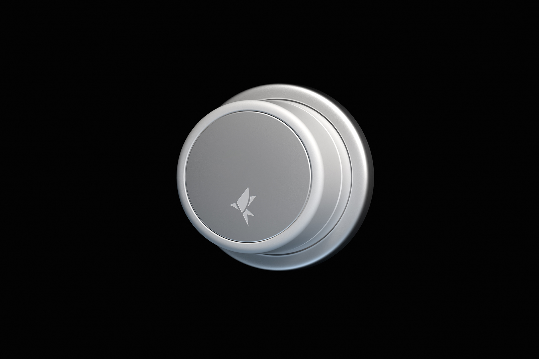

TERNCY小燕科技是一个创立于2015年的智能家居品牌,身处一个与国人日常生活息息相关的领域,小燕科技始终希望能将更多的便利带入“寻常百姓家”。经过几年的发展,在走向更广泛的消费人群的同时,品牌也面临着旧形象老化的问题。如何让整体视觉更具现代性和科技感,是我们在设计时考虑的重心。
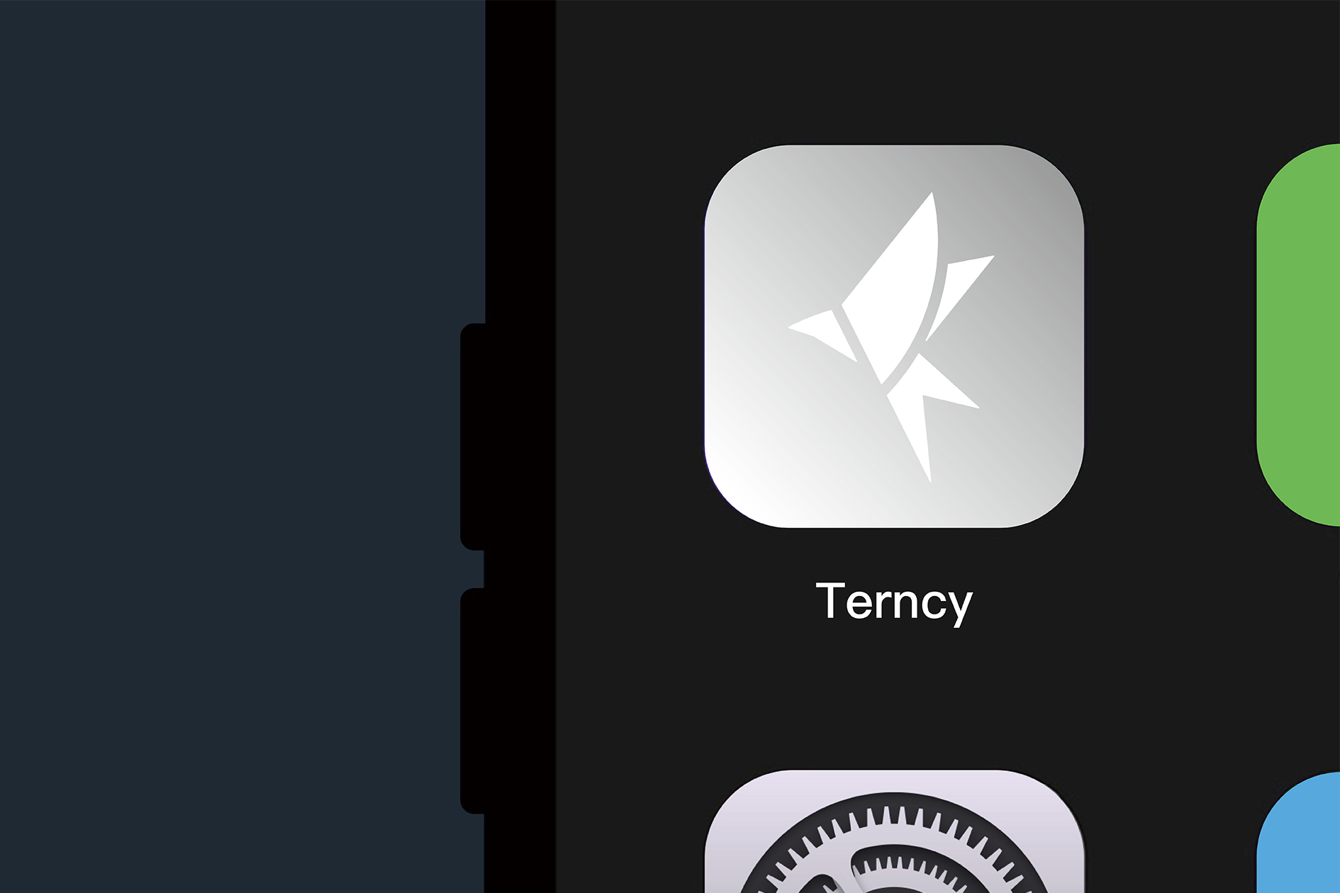
新生成的小燕图形标志在原有的基础上使线条更流畅、翅型更饱满,同时它也是一颗飘逸的五角星形态,呼应小燕科技能带来的更人性的智能家居体验。就像品牌所倡导的,当改变在细微中发生时,就改变了很多。
TERNCY is a smart home brand founded in 2015, in a field closely related to the daily life of the Chinese people, Xiao Yan Technology always hopes to bring more convenience to ordinary people. After a few years of development, the brand is facing the problem of aging its old brand identity while moving towards a wider consumer base. The focus of the design was to make the overall visuals more modern and technological.
The newly generated Xiaoyan graphic logo is based on the original one with smoother lines and fuller wings, and it is also in the form of a floating five-pointed star, echoing the more humane smart home experience that Xiaoyan technology can bring. Just like what the brand advocates, when change happens in the smallest detail, it changes a lot.
Art Director: Tong Yi
Designer: Liu Xuan / Tong Yi
Year: 2021
Client:上海小燕智能家居