
Liangzhu Center of Arts
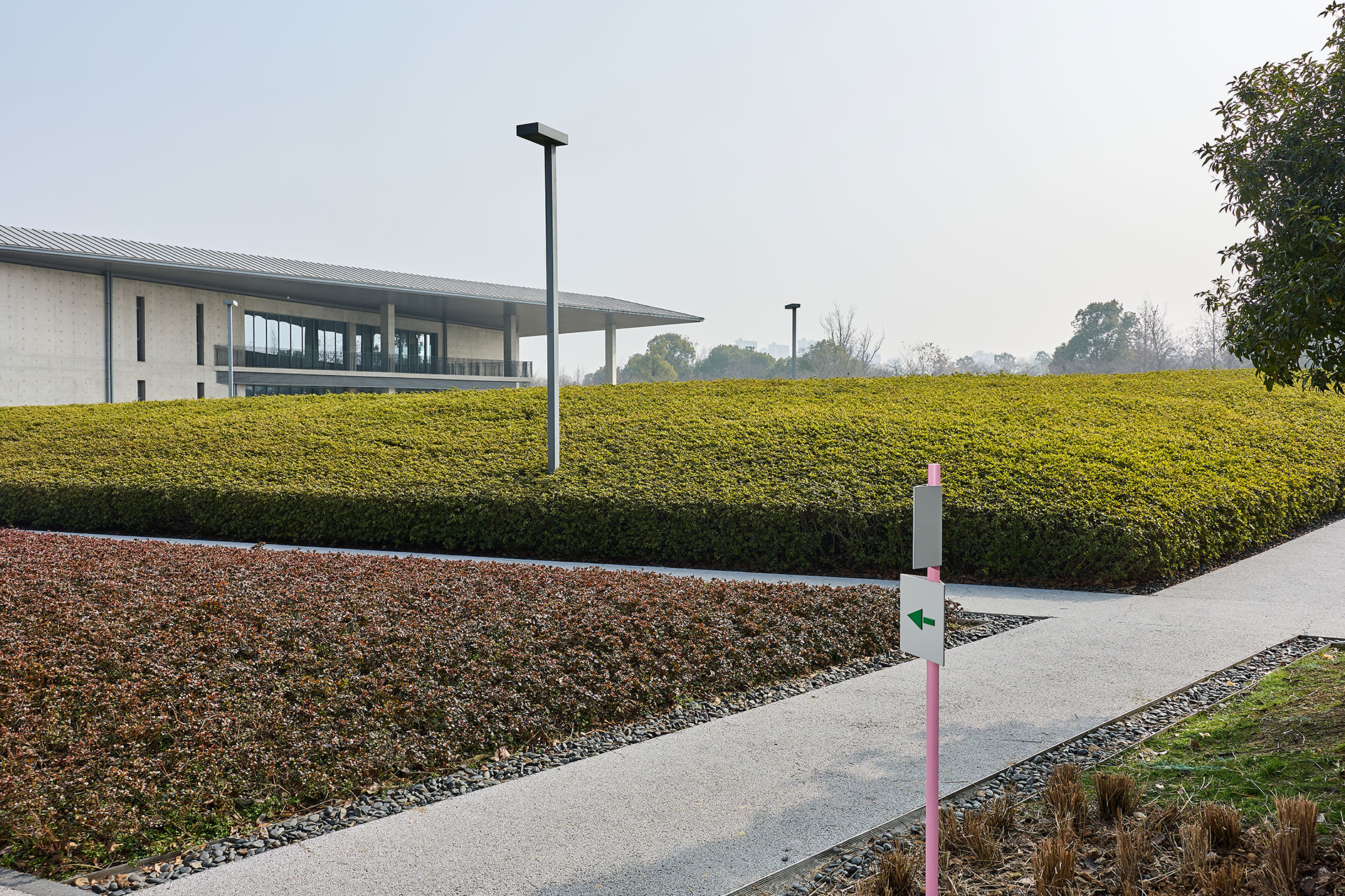
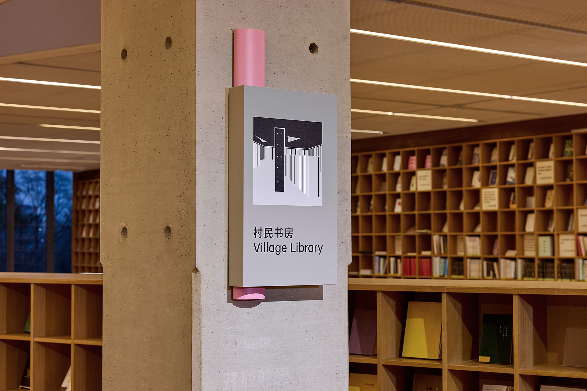
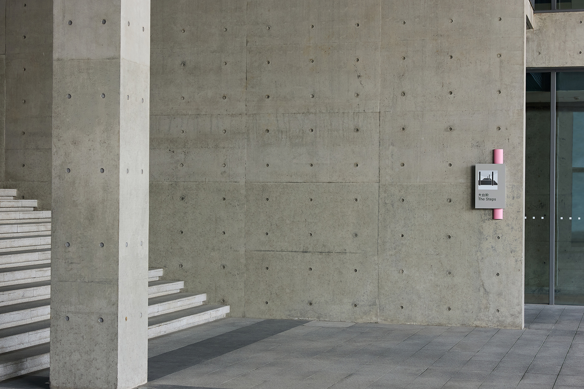
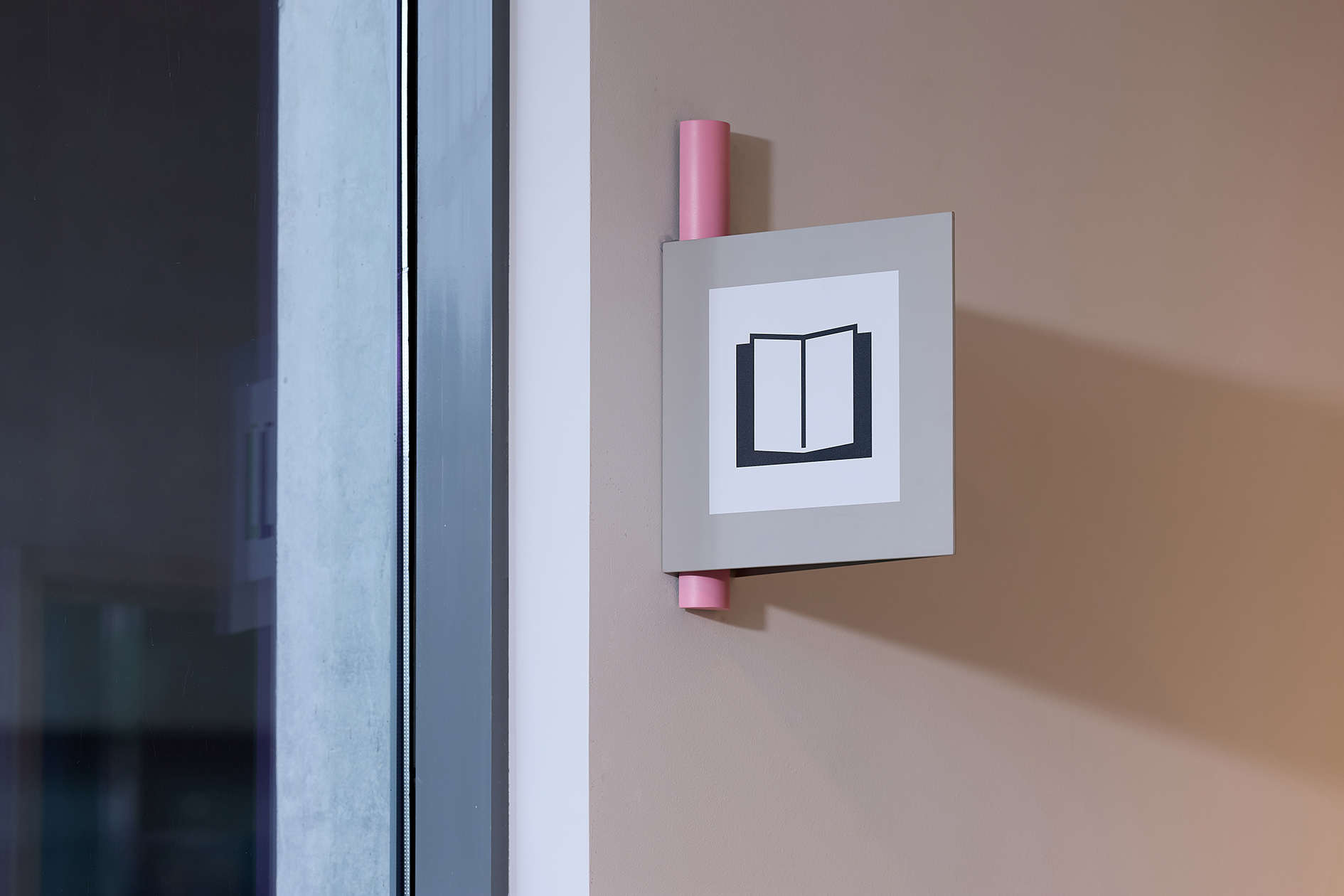
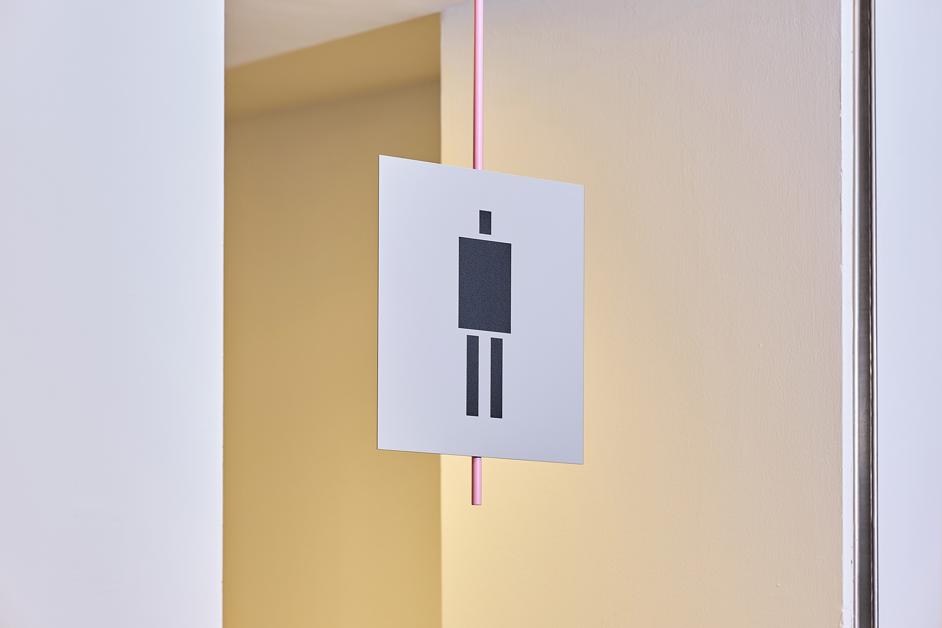
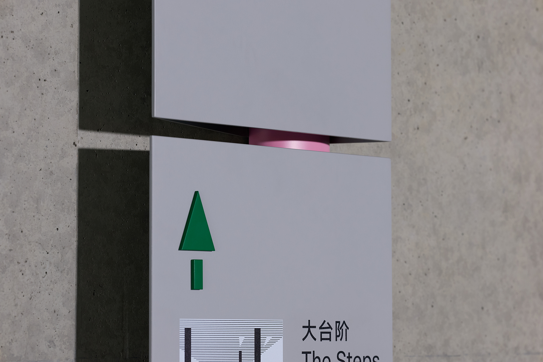
在良渚文化艺术中心,建筑师安藤忠雄以清水混凝土、几何秩序与自然光线构筑了一处关于时间与空间的场域。步入其中,空间不只是被观看,更像是一段由结构、尺度与光影共同展开的叙事。值开馆十年之际,quinsay design 为其设计全新的导视系统,通过尺度各异的金属标牌,将信息功能转化为空间体验的一部分,使导视与建筑形成关于“构成”的呼应。
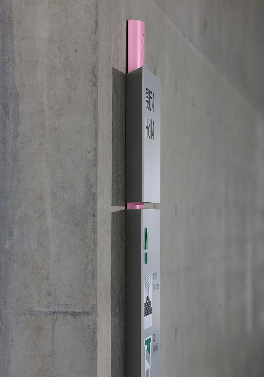
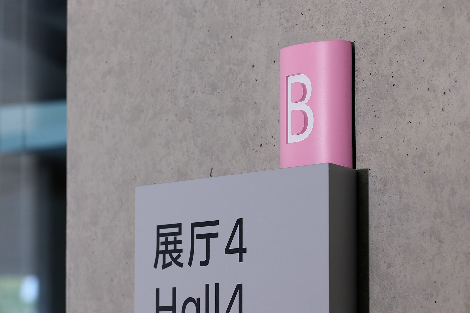
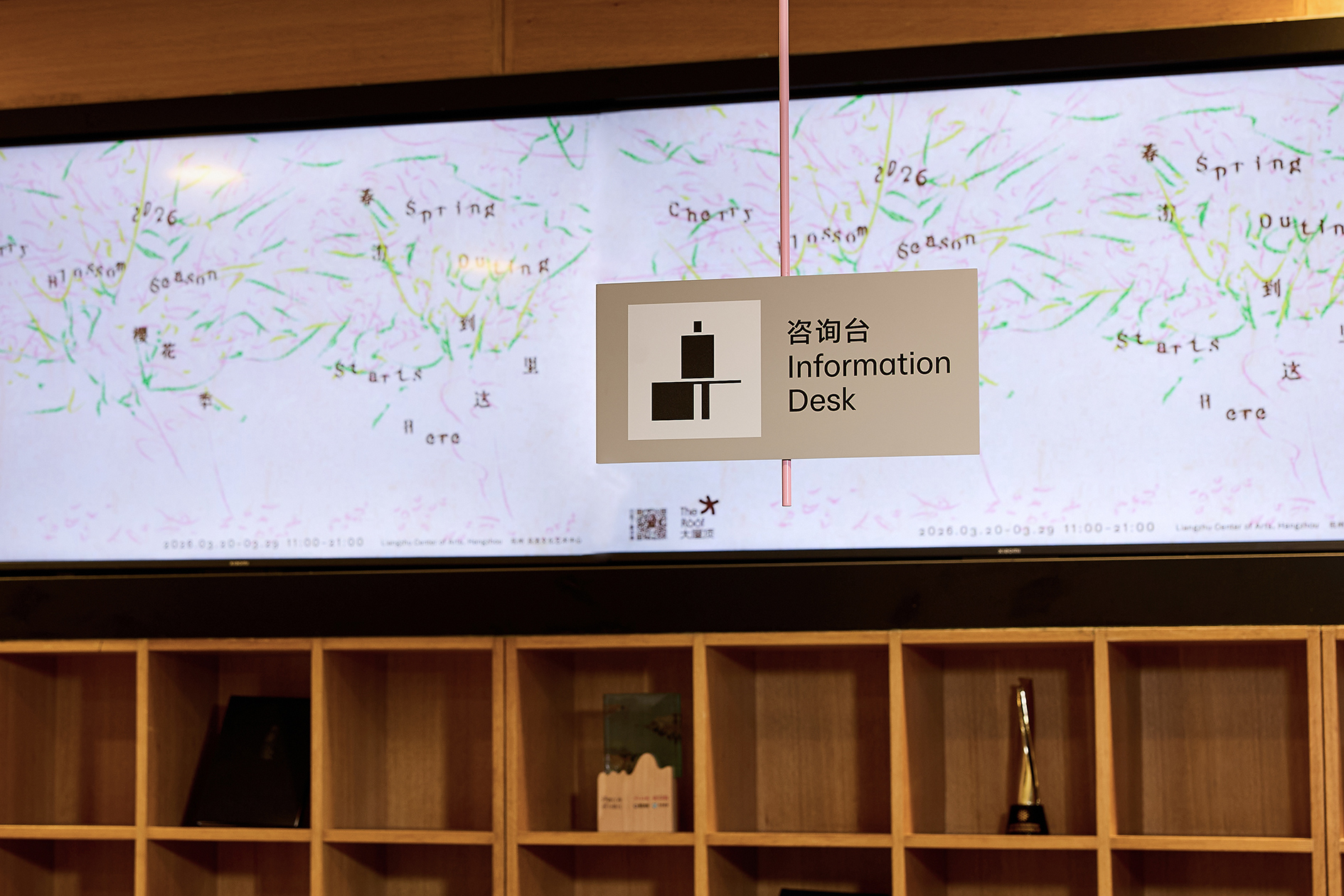
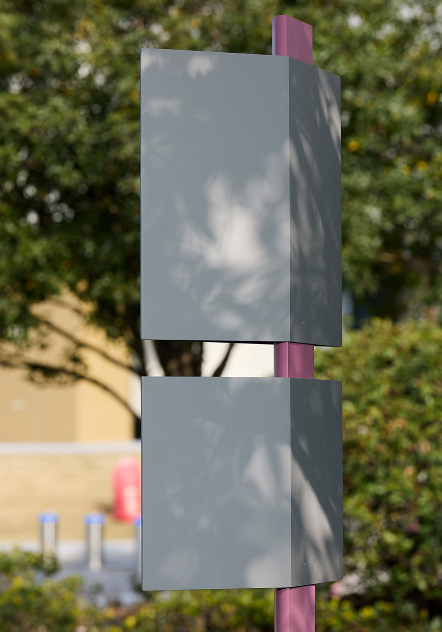
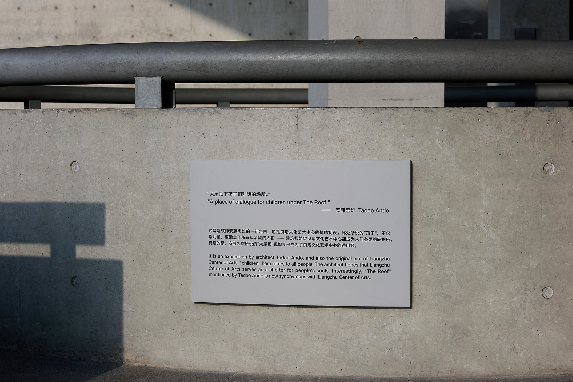
设计从建筑自身的几何语言出发,回应中庭、屋顶与混凝土体块所形成的视觉张力。悬挑、倾斜与切面的处理,使标牌成为建筑结构的微观延伸:挂式标识介入空间,形成轻盈的悬浮关系;贴墙式标牌借由角度变化创造随时间移动的阴影;立式索引牌则通过结构组合呈现清晰的构成关系。导视不再是附加的信息载体,而成为空间中的视觉坐标。
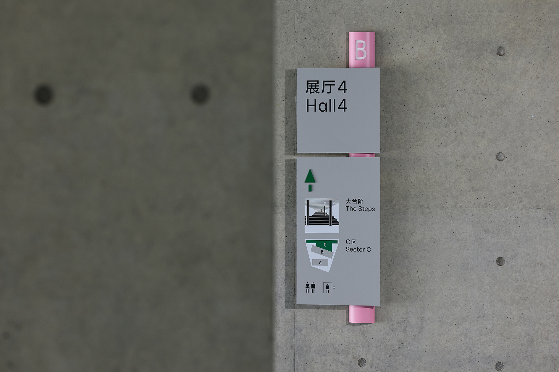
整个系统以铝合金作为主要材料,通过氟碳烤漆、高清 UV 微喷、数控雕刻等工艺,使材料自身的精密感与清水混凝土的粗粝质感形成对话。设计保留结构连接、支撑关系与内部构造的逻辑,让制造与安装过程成为视觉语言的一部分。文字与图形通过内凹雕刻获得物理深度,使信息随着光影变化融入材料表面。
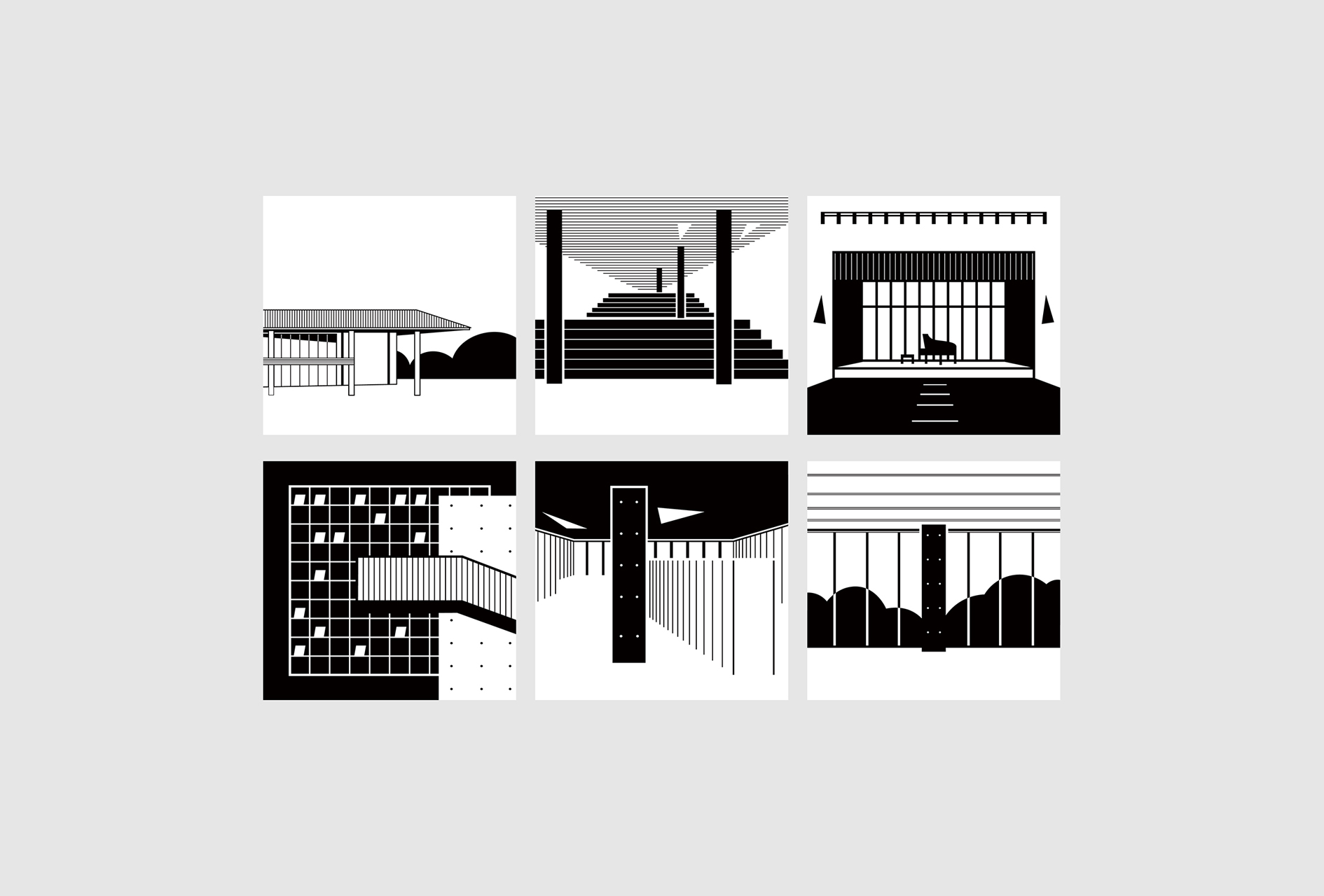
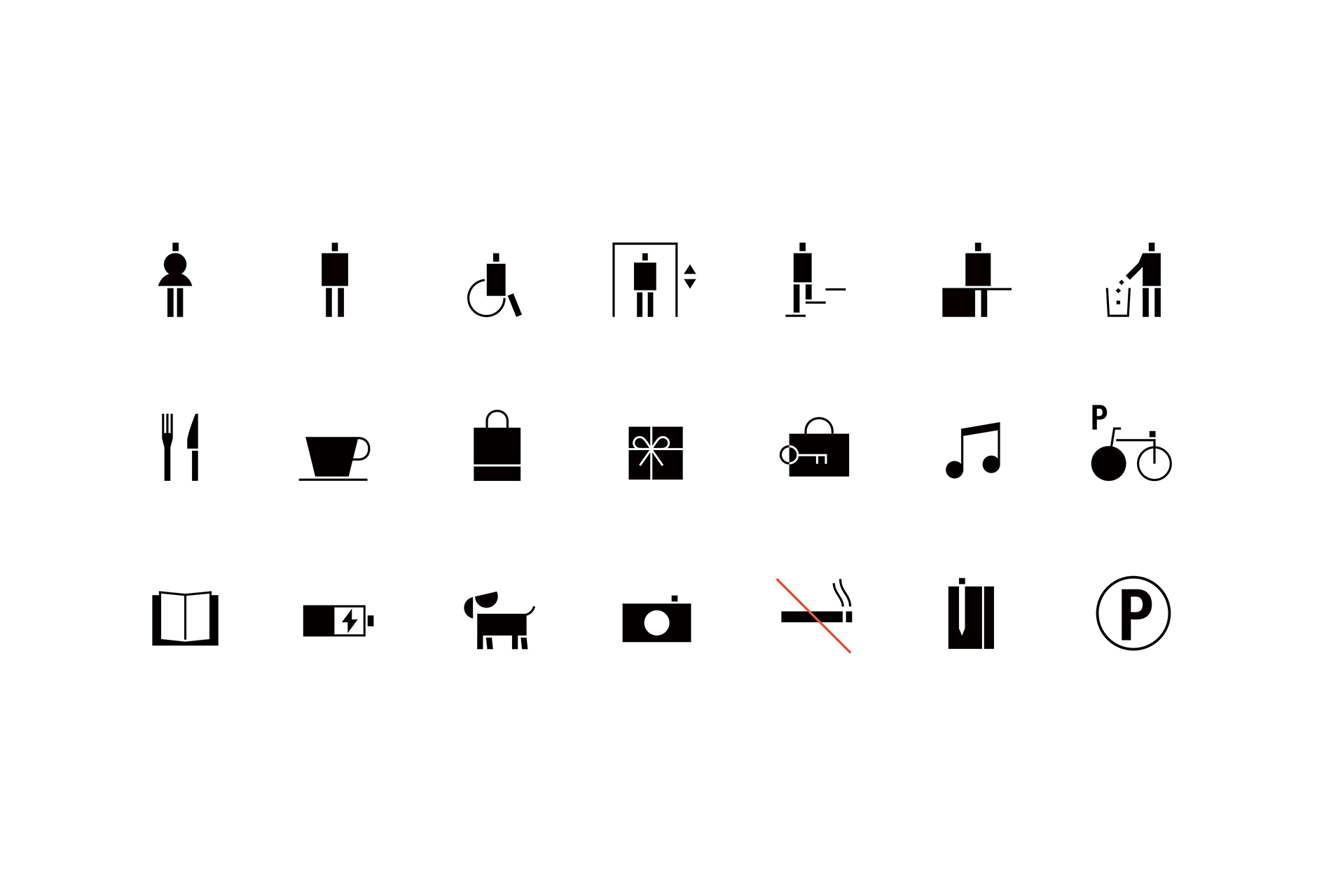
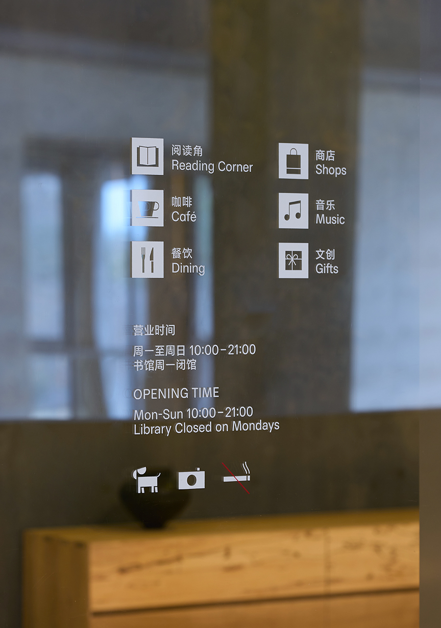
图标系统延续建筑的抽象逻辑:一组图形提取屋顶切线、光影缝隙与中庭几何等建筑片段,以黑白形式构成具有场所记忆的视觉图景;另一组功能图标则从圆、方、三角等基本形态出发,以极简方式建立清晰的导向关系。通过对结构、材质与光影的转译,quinsay design 希望导视系统成为建筑空间的一部分——不是向空间赋予新的形状,而是在已有结构中发现那个必然存在的形式。
At Liangzhu Culture & Arts Center, architect Tadao Ando creates a space shaped by exposed concrete, geometric order, and natural light — a place where time and space are continuously revealed. Moving through the building is not merely an act of navigation, but an experience of reading a spatial narrative composed through structure, scale, and shadow. On the occasion of its 10th anniversary, quinsay design developed a new wayfinding system for the center, transforming functional information into an integral part of the spatial experience and establishing a dialogue with the architecture through the language of “construction.”
The design originates from the geometric vocabulary of the architecture, responding to the visual tension created by the central courtyard, roof structures, and concrete volumes. Through cantilevered, angled, and precisely cut elements, the signage becomes a subtle extension of the architectural structure itself. Suspended signs introduce a sense of lightness and spatial balance; wall-mounted signs create shifting shadows through their inclined surfaces; and freestanding directories reveal a clear structural composition. Wayfinding is no longer an attached information layer, but a visual coordinate embedded within the space.
The entire system is crafted from aluminum, with processes including fluorocarbon coating, high-definition UV printing, and CNC engraving, allowing the precision of the material to engage in dialogue with the raw texture of exposed concrete. The design preserves the logic of structural connections, supports, and internal construction, allowing fabrication and assembly to become part of the visual language. Engraved typography and graphics gain physical depth, allowing information to merge with the surface through changing light and shadow.
The icon system continues the abstract language of the architecture. One layer extracts architectural fragments — roof lines, gaps of light, and courtyard geometries — transforming them into monochromatic graphic compositions that preserve the memory of the place. Another layer develops functional symbols from basic geometric forms such as circles, squares, and triangles, creating a concise and intuitive navigation system. Through the translation of structure, material, and light, quinsay design seeks to make wayfinding an inherent part of the architecture — not imposing new forms upon the space, but discovering the forms that already exist within its structure.
Art Director: Tong Yi
Designer: Tong Yi / Teki / Bao Sanchuan / Duan Anran
Photographer: Li Xiaolong
Year: 2024—2025
Client: Liangzhu Center of Arts